Introduction
tabify.no
Design and experience
We designed and built the website, and gave the Tabify web app a light design lift.
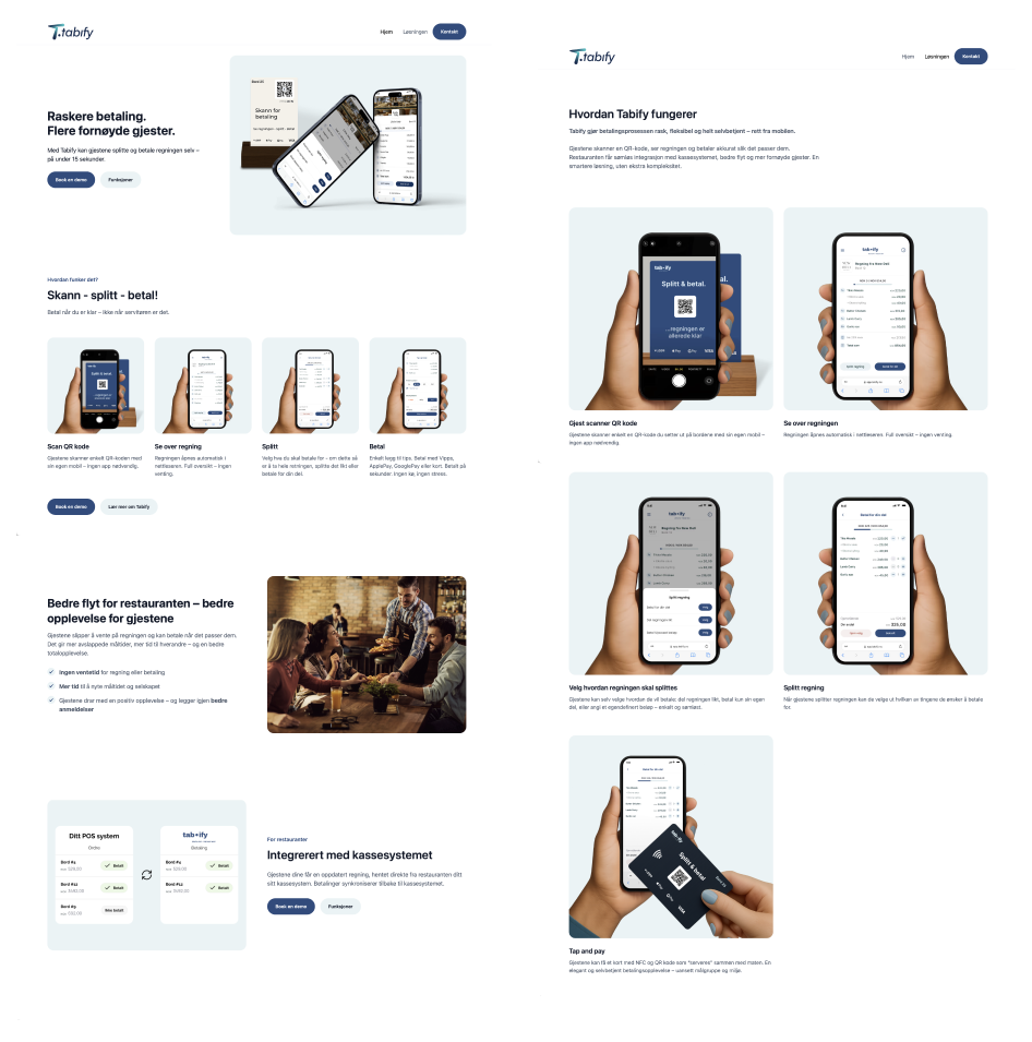
Tabify is a Norwegian payment platform that lets restaurant guests scan a QR code, see their bill and pay without waiting for a waiter. The goal was to make paying fast and self-service, straight from the guest phone. The solution integrates seamlessly with the point-of-sale system of the restaurant and is meant to improve both table flow and customer satisfaction. Tabify wanted a clear, persuasive website along with a design upgrade of the web application. They also needed a physical table card for restaurant tables that reflected the brand.
Design and experience
Visual identity and interaction design
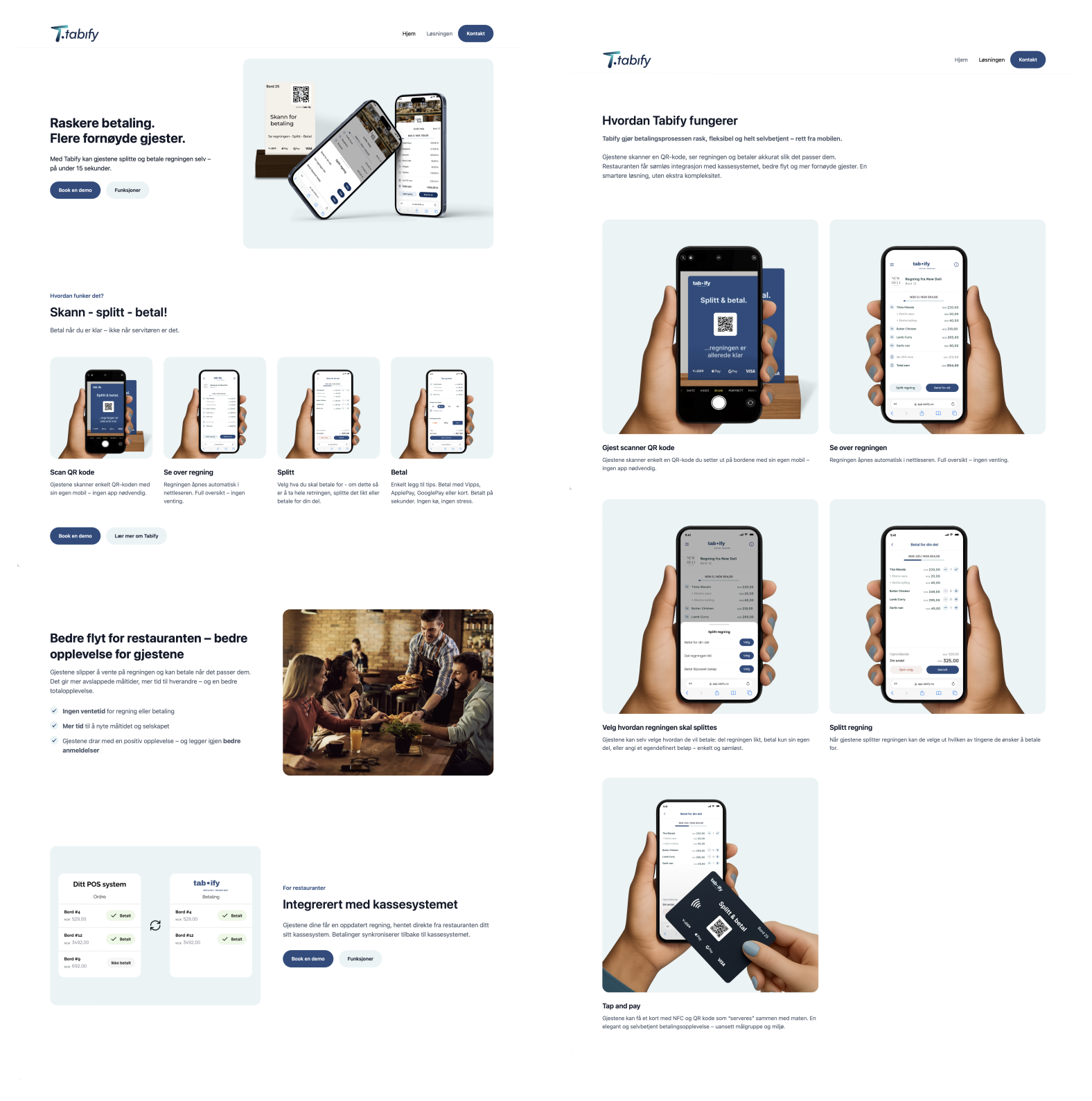
We produced a design in Figma. To explain the payment flow we developed a series of mockups with illustrated hands scanning, splitting and paying the bill. These scenes are used both on the web and in sales material to make the process easy to understand. The visual style is modern and playful, with large headings, clear illustrations and a colour palette that gives a professional but friendly impression.
We also designed table cards for restaurants. The card combines an NFC chip and a QR code so guests can scan or tap with their phone. The graphics on the card mirror the colours and typography of the web design.
The solution
Website in Webflow
The site was built in Webflow, which made it possible to create a responsive, animated interface without heavy code, so the client can make simple changes themselves. The home page communicates the value proposition with a punchy headline: Faster payment. More satisfied guests. It describes how guests can split and pay the bill in under 15 seconds. Under the heading Scan, split, pay follows an illustrated walkthrough of the process: scan the QR code, see the bill, choose how to split it, and pay. We added clear calls to action for booking a demo.
On the Solution page the process is expanded: guests scan the QR code with their own phone without an app, see the bill in the browser, choose between different payment methods (split the bill evenly, pay their own share or enter a custom amount) and pay via Vipps, Apple Pay, Google Pay or card. After paying they can receive a digital receipt and leave a Google review directly from the confirmation page. We also highlighted the tap-and-pay function with the NFC card.
Design and experience
Design lift
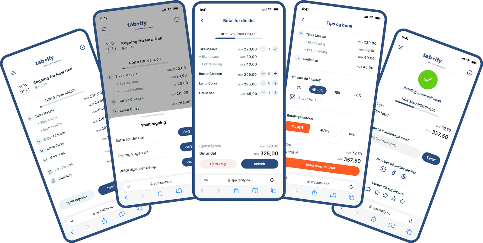
Tabify already had an existing design for the web solution, but wanted a design lift. We took the existing structure as our starting point and implemented our design system: clean typography, airy surfaces and more consistent use of colour. We updated the iconography and button styles to make actions clearer. The focus was on giving users a coherent, professional experience that matches the marketing site. Screenshots of the upgraded solution were used on the website to illustrate functionality and design.
The solution
Result
With a combination of considered design and user-friendly development, Tabify got a coherent profile across digital and physical surfaces. The website communicates clearly why restaurants choose Tabify: integration with point-of-sale systems, faster table rotation, more tips and more reviews. For guests it describes a frictionless payment flow that gives full control and a paperless receipt. Together with the table card, this gives a seamless first impression and an easy way to try the solution.