Introduction
tabl.no/
Design and experience
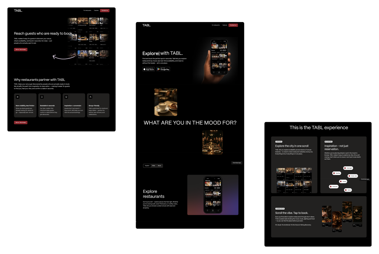
We designed and built a website in Webflow for TABL.
TABL is an app that makes it easier to explore restaurants and find the right table. Link Utvikling was asked to build a landing page that appeals to restaurant guests and gives a window into the features of the app. The project was carried out in Webflow with the design produced in Figma.
The concept
Goal and concept
The goal of the page was to convey how TABL makes restaurant visits more inspiring and less frustrating. The messages focus on three core steps: discover, filter and book.
- Discover: TABL presents an overview of available restaurants in one interface. You do not have to visit each website individually; TABL lets you explore availability across dozens of places instantly, all live, all in one place.
- Filter: instead of traditional categories, users can filter by mood and occasion. The page describes how you can choose the right place for a date, lunch with friends or a solo outing; the mood-based filters help you match the atmosphere to the appetite.
- Book: the landing page highlights that reservations can be made quickly because the app shows real-time capacity.
These three steps form the information architecture of the whole page: a journey from inspiration to action.
Design and experience
Design choices
The solution
Dark theme with colourful accents
The whole page is built around a dark background theme with large images and a red-purple accent colour. The purpose is to create a sophisticated, exclusive mood that suits premium restaurant experiences. The contrast gives white text and colourful images extra effect. The most important actions (download buttons, submit forms, filter buttons) are marked with deep red buttons so they stand out against the dark background, matching the style developed for the app itself.
The solution
Visual stories
The imagery is central. The hero section shows a hand holding the app, and further down the question What are you in the mood for? is introduced with images of a romantic date, morning coffee, dinner with friends and lunch. These cards speak to the emotions and support the idea of choosing a place based on mood. The scrolling of the cards is animated in Webflow to give the page life.
The solution
Clear call to action
The primary goal of the page is to drive app downloads. Download buttons are therefore visible throughout: in the hero section, as a sticky button on the right as you scroll, in the Start booking with TABL section and in the footer.