Motivati
Website for Motivati
A redesigned website in Webflow for the HR tool behind Motivasjonsanalysen™.
Introduction
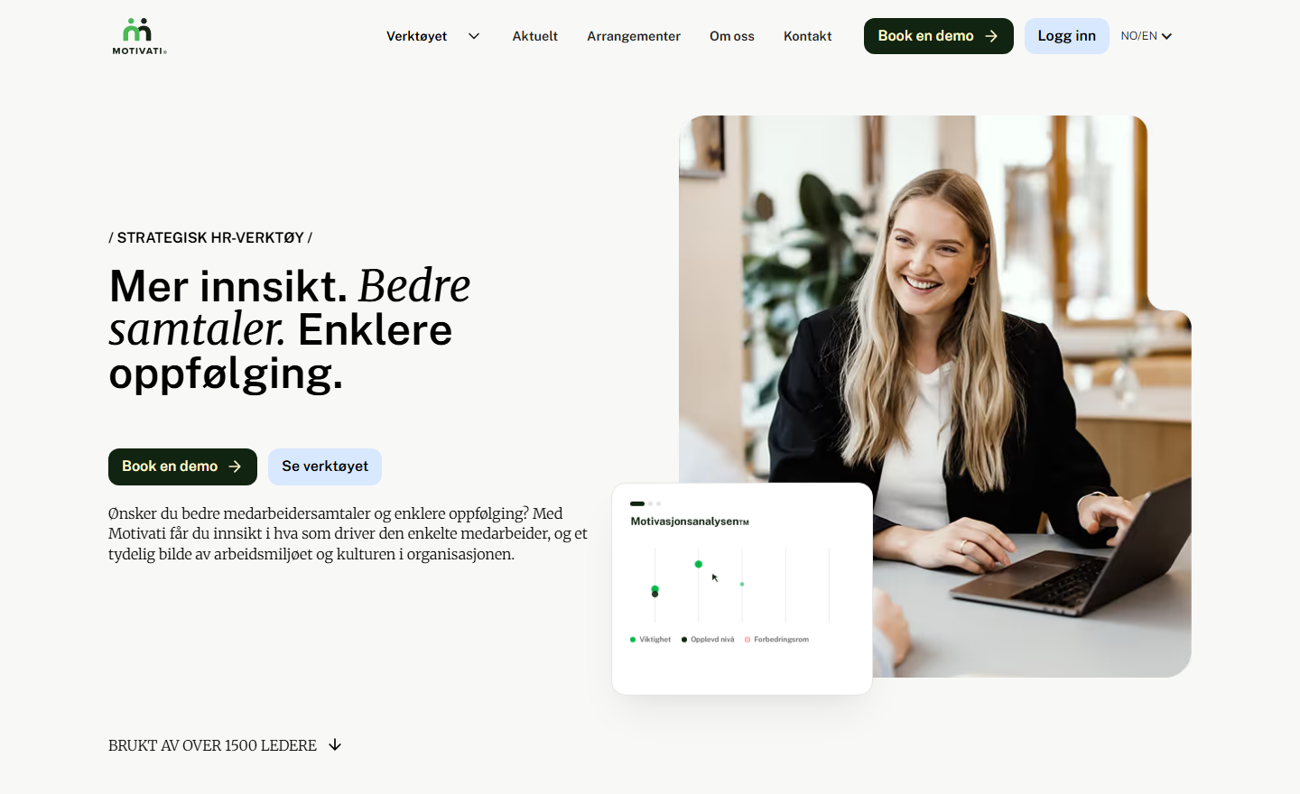
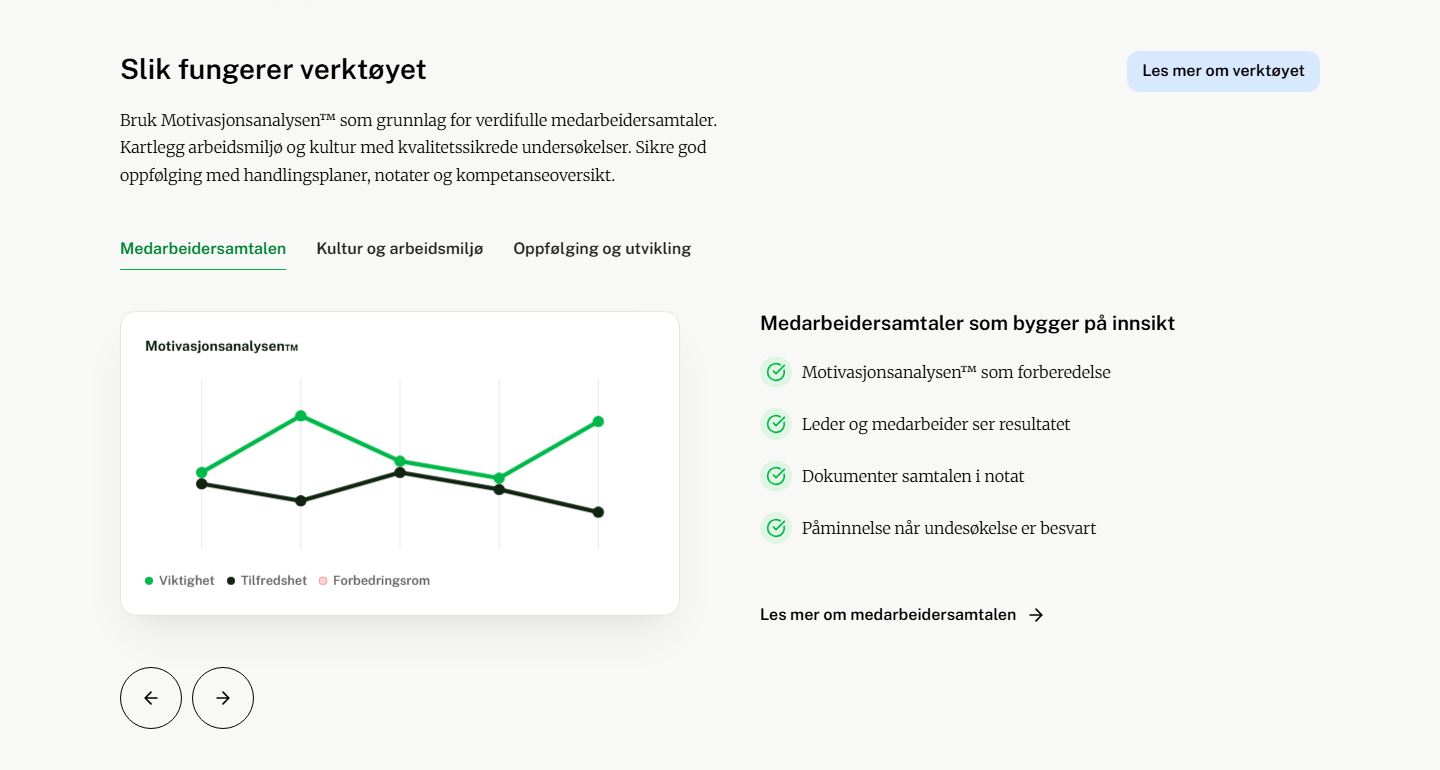
Motivati is a Norwegian HR tool for development conversations, workplace surveys and follow-up over time. At its core sits Motivasjonsanalysen™, which the manager and the employee each complete before the conversation, so that both arrive with the same picture of what drives that person.
We designed and built the new website at motivati.no in Webflow.
The concept
The expression
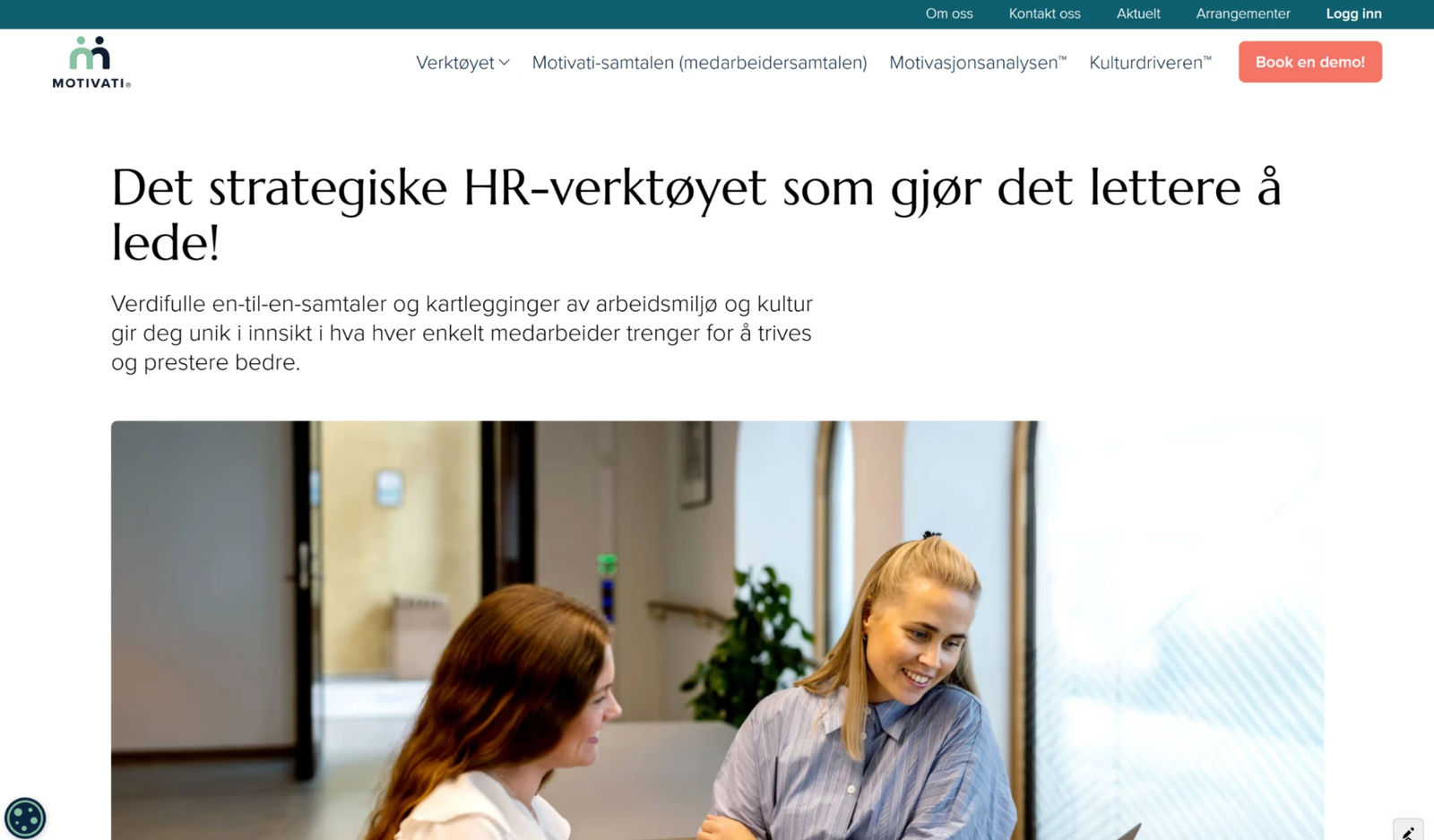
The previous site was built like a classic software site: a dark teal top bar, a coral demo button and two menu rows offering eleven choices before you had finished reading the headline. It told you what Motivati is, but little about how it feels to use.
Motivati is about conversations between people, and we wanted the site to carry that. We lowered the temperature of the colours, gave the content air, and let photographs of real working situations and screenshots from the tool do the work instead of claims.
The headline was cut to three parts, each closed with a full stop: more insight, better conversations, simpler follow-up. The middle part is set in italic serif inside an otherwise sans-serif headline. It is a small move, but it gives the sentence a centre of gravity and ties the two typefaces of the identity together in the very first line.
Design and experience
Design
The typography is set in Public Sans and Merriweather. The sans carries headlines, buttons and interface; the serif is used for body text and for the italic passages in the headlines. The combination gives the site a calm, almost editorial tone without it ceasing to look like software.
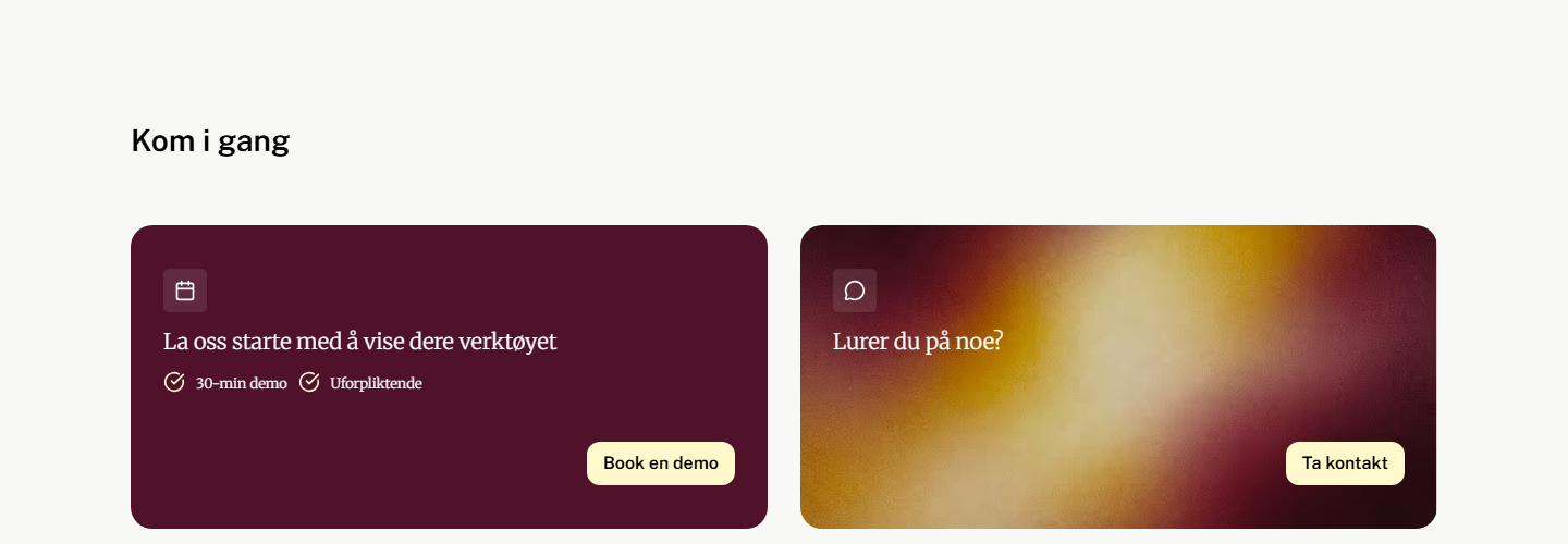
The palette is built around a warm off-white base, with a green-black as the primary colour on buttons, the footer and text. Light blue marks secondary actions and the larger content surfaces, and a muted sage green is used for confirmations and active tabs. For the closing section we allow two warmer surfaces, plum and amber, so the page ends somewhere other than where it began.
The layout follows a single grid the whole way down, with clear section breaks and generous space between them. Images carry an asymmetric rounding that is repeated on cards and buttons, and the product shots sit partly outside their own frames. That gives depth without shadows and effects.
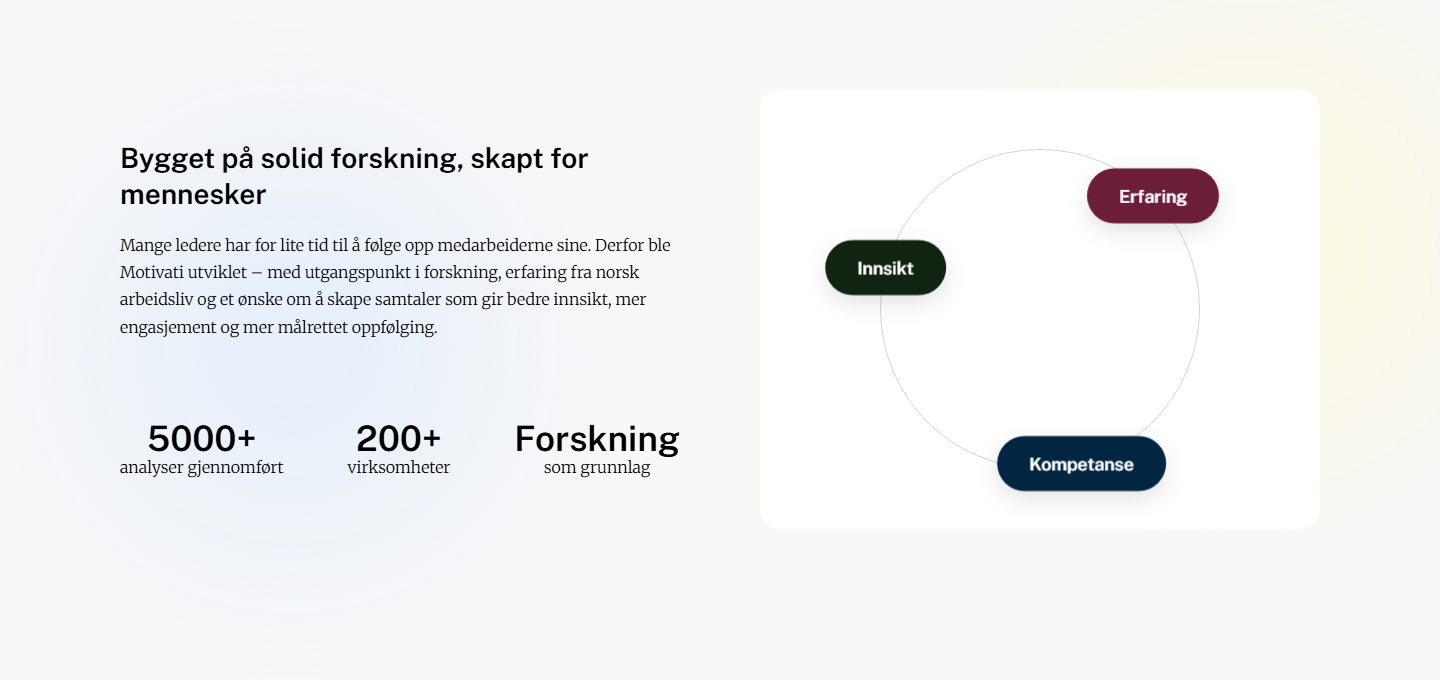
The content is prioritised by who is reading: managers, the HR department and employees each get their own entry point. The figures Motivati can point to are lifted into a row of their own rather than being buried in the body text.
Technology
Technology choices
The site is built in Webflow. That choice is first of all about who owns the content afterwards. Motivati publishes articles, customer stories and events regularly, and that work should not have to go through a developer. In Webflow these live as their own content types that the editor fills in like a form, and that meet the design already laid out on the other side.
Webflow also gives full control over markup and styling, so the design does not have to be bent around a ready-made template. Hosting, SSL and CDN are included, and there are no plugins to keep updated. We are a certified Webflow partner, and we use the tool where it is the right tool.
It is not the right tool everywhere. Had the site needed to be tightly integrated with the Motivati application itself, with logins and shared data, we would have recommended something else. Here the website is an independent surface in front of the product, and then Webflow is the fastest route to something the client can run themselves.
The site is bilingual, with Norwegian as the default and English available from the menu.
Technologies
WebflowWebflow CMSFigmaPublic SansMerriweather