Introduction
www.itatravel.no
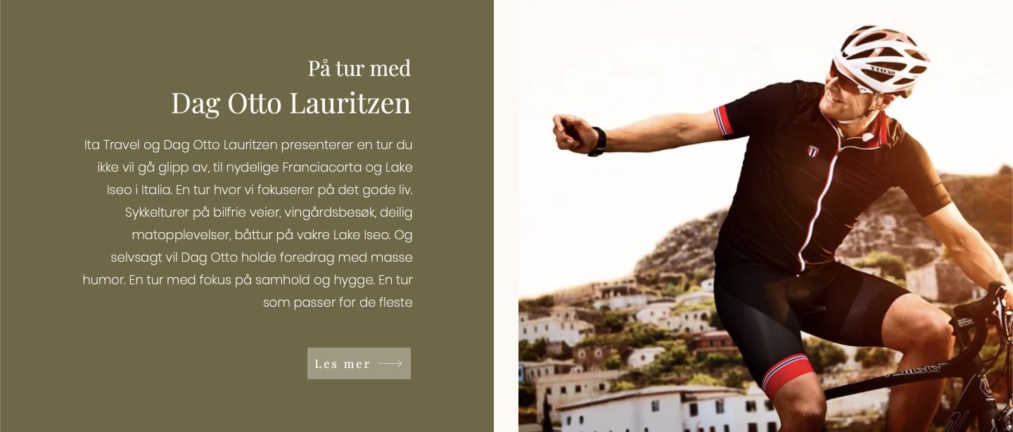
Ita Travel is a travel agency with a passion for all things Italian. The company offers luxurious travel packages to different parts of Italy with a focus on food, drink and beautiful surroundings. The agency recently received a lot of attention after running several cycling tours in Franciacorta with Dag Otto Lauritzen.
The company went through a major transition with a rebrand that we at Link Utvikling contributed to. It resulted in a new name, a new visual identity, a new strategy and a new website.
We have only good things to say about the work Link Utvikling has done with our brand and digital strategy. Very professional, with a strong understanding of the wishes and needs of the customer.
The concept
Brand and concept
The client wanted a stronger expression rooted in the Italian, and in the easy feeling of being on holiday. After a brainstorm we landed on the name Ita Travel, a name that connects to Italy while leaving room for expansion and scale: Ita; Italia; International Travel Agency. We then wanted the logo to carry the feeling of Italy and holiday days, so it was drawn with soft letters and flowing lines to represent the flow of wine and sea. The client also wanted the Italian colours represented in the logo, so we added a thin underline in the colours of the Italian flag. The logo was made in several colours so it could adapt to different graphic contexts, and we chose olive green for the website. Green is well represented in Italy: in the green vines, in the plump olives beside the wine glass, and in the pesto that originates in northern Italy. Matching templates for social media were made for the client to use, and a digital strategy focused on customer experience was developed and put into action.

The solution
Website
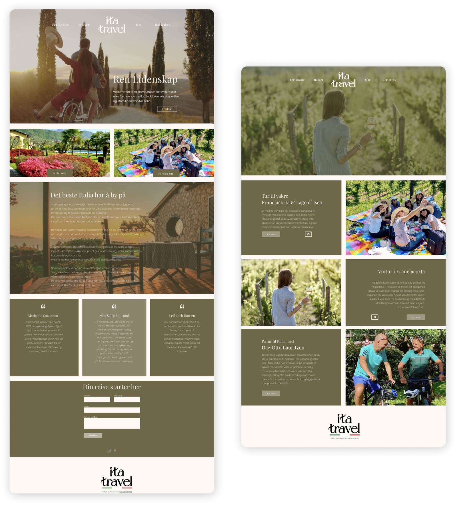
The website was built on the website builder Wix.com at the request of the client, who already knew the platform. The client wanted to be able to make future changes themselves and to have a full overview of their statistics. The site was designed with a focus on sorting the offerings of the company into clear categories. That led us to a menu with a centred logo separating the offerings: holiday homes and trips on the left, and company information and travel tips on the right. The client wanted the home page to promote the travel packages with a clear call to action. The website also received a lift in terms of search engine optimisation (SEO).